Category Archives: web

grum.com – Still Tweaking

While I’m done with the blog for the time being, I’m still tweaking the rest of the site. Most of the content on it is at least 3 years old. When I got it back up a couple weeks ago, I didn’t take the time to update the content as I really just wanted to get the site live again with a refreshed look. Now that it’s live, I can take the time to go back and update the content. :)

Today, after finishing the “Grum” theme on the blog, I updated the Portfolio section. I added some more sites and graphics that I have worked on in the recent past. I also added an updated version of my résumé.

In the very near future (most likely before the week is up) I will be updating the rest of the site as well.

Skinning the Blog, Part II

Well sir, I think I’m done here!

I originally started out with a copy of twentytwelve. My thought was to modify the necessary items and make it my own. I worked on it for a about a day and noticed that I was changing a lot of HTML and PHP. I wasn’t sure I liked this as it was killing the widgets. I took a few days off.

Then, last Tuesday, I went to a Meetup of the FredWebTech group. The night’s presentation: building child themes in WordPress. How timely! I enjoyed the presentation and decided to scrap what I had already done and start over, this time only copying what I needed to from twentytwelve and overriding the original files with ones in my child them. It worked so well that I did it all this morning in about 3 hours.

The only HTML I changed was adding some custom stuff for the header to bring it inline with my site’s header and in the footer. I also added one tag to the sidebar files. The rest was all CSS updates. Adding an ID to the body tag made it easy to override the parent theme’s CSS.

Feel free to poke around. If you see anything amiss, please leave a comment on this post and I will fix it post-haste!.

After this morning’s work, I feel that WordPress themes are easier to work with than I anticipated. At least, building a child theme is. ;)

How Not to Use Twitter for PR

Had this conversation today (it started yesterday, but the first response was today… timely!):
This is how you don’t use Twitter to talk to your customers or possible customers. Just sayin’.

Also, was there any slander in there on my part? I don’t think so. Was just reporting the facts as I witnessed the driver smoking while they drove the food truck by my office. And for the record, I love the food truck concept. I support them.

I’m back

After just over 3 years, I’m back. I’m restarting the project. I’m also going to use this blog as a way to document my involvement in a few web developer groups in the area.

January Refresh Baltimore: Reinhard Stebner

Fantastic presentation by Reinhard Stebner tonight. I wasn’t expecting much and but left enlightened and very happy that I went. Stebner’s presentation taught me a lot.

Take aways

Much like tables (which should only be used for actual tabular data, duh), avoid bulleted lists except for things that need to be in lists: “cat, dog, mouse.” This means no lists for navigation. Divs and spans are the way to go as they’re invisible to screen readers. Stebner was tabbing through the far too many lists on mica.edu and they gave no clue as to where he was on the page and no information other than “List, 10 items. List, 6 items…” With divs and spans, the content is immediately available to the screen readers.

Content should be grouped logically with headers. H1 should start actual content. Don’t mix the order. Be logical! JAWS can tab through headers, easier to locate sections of content. JAWS can also tab through images.

Autoplay on video/audio without keyboard shortcuts for the controls is bad. BAD.

I always add them as I thought it helped, but screen readers ignore titles on anchors. I thought they went hand in hand with Alt tags on images for accessibility, but no. However, Alt tags on images ARE important. As they always were. Titles are, however, extremely helpful with form fields. Stebner went to bing.com and when the focus hit the search field, the screen reader said
“Enter your search term.” Brilliant.

Screen readers ignore HTML comments. (I should have known this.)

Use page appropriate titles that are descriptive of the page’s content. It’s the first thing read when the page loads. Ambiguous titles tell nothing about content and can be confusing.

Firebug is a useful tool for accessibility.

Links

http://www.w3.org/WAI/
http://www.w3.org/WAI/intro/aria
Surfing the Internet with JAWS and MAGic! – Great site to learn how to make HTML accessible.

Thanks to Mike for making it all happen. It wasn’t that cold outside. ;)

A huge thanks to Reinhard Stebner for the lesson.

00000011

So, in keeping with things that I like (or happen to have bookmarked ;), I hit this one the other day. This is one of my hobbies and while I’m not currently a member, I hope to be one some day (or at least as good a player as some of the members I’ve met – they’re incredible).

In looking at the site, it’s not bad, but IMO could really use a make-over. I might toss something together and send it over… who knows. At any rate, judging by the look, I had a feeling that it was not up to snuff. I was right.

Originally written in HTML 4.01 Transitional (yay) and CSS, the validator claims the HTML has 34 errors, but the CSS is error-free. Imagine that. The only problem with the CSS then, should be file size. And once I convert the table based mark-up to semantic HTML 4.01 Strict, that becomes a non-issue. See the numbers.

It didn’t take long to work this one through. I’m having issues with the menu in IE6, but given I’ve done 2 or 3 similar menus that work fine, I should be able to figure out why this one is not being treated nicely. Methinks I’ve stared at it too long for the moment. Fresh eyes after the holiday.

Images:

theirs (some images are random):

mine:

Numbers:
Keeping with the same numbers as last time, here are the real results:

Theirs:

  • HTML lines: 297
  • HTML file size: 21,752 b
  • CSS file size: 13,638 b
  • CSS images: 0 b
  • Total: 35,390 b

Mine:

  • HTML lines: 213
  • HTML file size: 16,949 b
  • CSS file size: 2,168 b
  • CSS images: 109 b
  • Total: 19,226 b

Conclusions:
A grand savings of 16 kb on this one. And once again, ALL my code validates. The real conclusion from this site is that I’m really getting good with the code. Between work and this stuff, I’m able to crank out the HTML and CSS very fast with minimal initial errors. This is fun practice.

00000010

I like this guy’s music. A lot. The other day, I went to his site and lo and behold! there was a new version up. They had changed everything. I was happy as it was a better layout than the previous one, imo, and it looked like the code might be up to web standards. A quick “validate HTML” and I saw that I was quite mistaken.

Written in XHTML (why?) 1.0 Transitional, it supposedly had about 20 errors. I looked into the code. While it did have some similarities to CSS-styled code (it had lots of divs!), I quickly noticed that it was a table-based layout. Again! Apparently, the CSS was mainly for font-related stuffs, and some sizing, but not much. Not only was it table-based but it was in a “nested” hell. I can only assume that it was written with an “html editor.” I don’t like those things.

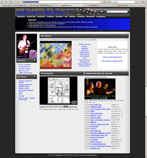
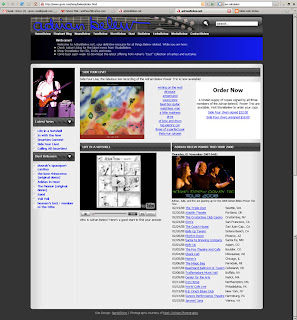
My version was written in semantic HTML 4.01 Strict and CSS that validate as such. The only table used on the page is for the tabular data located in the bottom right area. I think the screens and the speed reports speak for themselves:

Theirs:

Mine:

Numbers:
I just gleaned a few important ones from the speed report. Looking at only the html, css, and css images:

theirs

  • html lines of code: 275 (after indenting to my way: 383!)
  • html file size: 15,409 b
  • css file size: 19,136 b
  • css images: 144,512 b
  • Total: 179,057 b


mine

  • html lines of code: 269
  • html file size: 14,010 b
  • css file size: 4,262 b!
  • css images: 142,886 b
  • Total: 161,158 b

Almost 20 kb saved. Not too shabby, especially when one considers that ALL my code validates. One thing to consider: I could have shaved even more off had I wanted to play with images as some of the images on the page are actually 2 or 3 times the size that they’re displayed at.

Conclusions:
Once again, I had fun! I’m finding I enjoy doing this as I’m learning, I’m solving layout issues, and I’m doing something I enjoy. This time, all the images are from the source. I used none of my own. Also, while there are a few minor discrepancies regarding font sizes, it’s the overall layout I’m striving to duplicate, not the exact position of every last word. I use a base font-size in the body and then %’s of that in the various sections. The original used pixel based sizes and this is the main reason for the slight difference in the screen shots.

I also learned today that it is possible to embed YouTube videos in a page and still be valid Strict. In IE 6, there were a issue with spacing: between the black/blue area and the main section below, padding was about twice what it should have been. Sounds like ‘twould be time for an IE CSS hack.

Finally, my apologies to Adrian and especially to Rob and Scott who work on the site. No offense is intended by this; it’s just an exercise in coding for me.

00000001

This is the site that started this project. I did it for no other reason other than I was bored. I did it over a 4 hour block of time during which I also cooked dinner for the fam and ate it.

The original was written in html that the validater claimed had 20 errors, including no DOCYPE. The CSS was basic and only really covered font related styling. The main layout was table based.

When finished, I had copied the layout using semantic Strict HTML and CSS. Both were valid. I used original images where I could, but made some minor changes, mostly concerning drop shadows. In future Strikes, I will strive to use only the graphics provided by the original page. But this was my first so I wasn’t necessarily thinking that way, plus there was a lot going on with the tables and the drop shadows on images were actually separate images. Didn’t want to mess with it. But as you can see in the screen caps, my version really isn’t much different overall.

Screens of the site:

Theirs:

Mine:

The speed reports:

Theirs:

Global Statistics

Total HTTP Requests: 44
Total Size: 110750 bytes

Object Size Totals

Object type Size (bytes) Download @ 56K (seconds) Download @ T1 (seconds)
HTML: 12226 2.64 0.26
HTML Images: 52446 18.05 7.88
CSS Images: 119 0.22 0.20
Total Images: 52565 18.27 8.08
Javascript: 38822 8.34 0.81
CSS: 7137 1.62 0.24
Multimedia: 0 0.00 0.00
Other: 0 0.00 0.00

External Objects

External Object QTY
Total HTML: 1
Total HTML Images: 38 Total CSS Images: 1 Total Images: 39 Total Scripts: 3 Total CSS imports: 1 Total Frames: 0 Total Iframes: 0

Download Times*

Connection Rate Download Time
14.4K 94.64 seconds
28.8K 51.72 seconds
33.6K 45.59 seconds
56K 30.87 seconds
ISDN 128K 15.56 seconds
T1 1.44Mbps 9.39 seconds

Mine:

Global Statistics

Total HTTP Requests: 20
Total Size: 51629 bytes

Object Size Totals

Object type Size (bytes) Download @ 56K (seconds) Download @ T1 (seconds)
HTML: 6912 1.58 0.24
HTML Images: 23979 6.98 2.33
CSS Images: 16211 4.23 1.09
Total Images: 40190 11.21 3.42
Javascript: 0 0.00 0.00
CSS: 4527 1.10 0.22
Multimedia: 0 0.00 0.00
Other: 0 0.00 0.00

External Objects

External Object QTY
Total HTML: 1
Total HTML Images: 11 Total CSS Images: 5 Total Images: 16 Total Scripts: 2 Total CSS imports: 1 Total Frames: 0 Total Iframes: 0

Download Times*

Connection Rate Download Time
14.4K 44.02 seconds
28.8K 24.01 seconds
33.6K 21.15 seconds
56K 14.29 seconds
ISDN 128K 7.15 seconds
T1 1.44Mbps 4.27 seconds

Conclusion:
Well, just from looking at the numbers, it’s about 55% more efficient. Do the math and compare the numbers. Fun was had. He got the code.

"will code for the hell of it…"

I’m a web monkey. I write strict HTML 4.01 and CSS that validates (usually on the first try). I do this with TextPad. No fancy-pancy editors for me. I use them when I have to, but personally, I just need a basic text editor and TextPad is my preference in that arena.

Recently, I started working part-time for a local non-profit (that works globally) and quickly found myself needing to code when I wasn’t at work. Apparently, 3 days a week was just making me hungry for more code.

So in the interest of learning more and keeping my kung-fu sharp, I’ve started playing with other people’s web sites. No hacking or badness going on, just “massaging” the code for my edification and my pleasure. This is what I do on Friday nights.

The first site I did belonged to a friend. I ended up sending him the results and the code (HTML and CSS). That was a couple months back. I also redid the 3 sites that I maintain. Today I finished the front page of a site belonging to one of my favorite musicians. While I will post the results here anonymously (for him), I’m not sure if I’m going to send his web monkeys the code as they just put up a new version (the one I “massaged”) and I don’t want to embarrass them. Besides, by the time anyone finds this blog, I’ll be dead. :)

For each site I hit, I only do the front page or main page if the front is just a splash page. Once finished, I take screen captures of the pages in Firefox and screen captures of the results of the Speed Check*. I will post these here with other information about each one. I will not be posting my code here although snippets may appear in places. Also, even though I’m only posting screen caps of the pages in FF, I will mention any issues that arise in making IE behave.

I guess that’s about it. From here on out, the posts will mostly just be the pages I hit. So, stay tuned and enjoy!

Also, if you want to hire me, then feel free to contact me via my blog’s profile.

*I use the one in the Web Developer Toolbar for Firefox.