I like this guy’s music. A lot. The other day, I went to his site and lo and behold! there was a new version up. They had changed everything. I was happy as it was a better layout than the previous one, imo, and it looked like the code might be up to web standards. A quick “validate HTML” and I saw that I was quite mistaken.
Written in XHTML (why?) 1.0 Transitional, it supposedly had about 20 errors. I looked into the code. While it did have some similarities to CSS-styled code (it had lots of divs!), I quickly noticed that it was a table-based layout. Again! Apparently, the CSS was mainly for font-related stuffs, and some sizing, but not much. Not only was it table-based but it was in a “nested” hell. I can only assume that it was written with an “html editor.” I don’t like those things.
My version was written in semantic HTML 4.01 Strict and CSS that validate as such. The only table used on the page is for the tabular data located in the bottom right area. I think the screens and the speed reports speak for themselves:
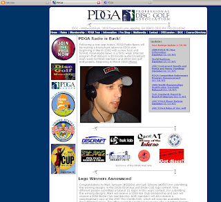
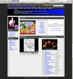
Theirs:

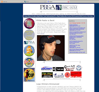
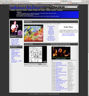
Mine:

Numbers:
I just gleaned a few important ones from the speed report. Looking at only the html, css, and css images:
theirs
- html lines of code: 275 (after indenting to my way: 383!)
- html file size: 15,409 b
- css file size: 19,136 b
- css images: 144,512 b
- Total: 179,057 b
mine
- html lines of code: 269
- html file size: 14,010 b
- css file size: 4,262 b!
- css images: 142,886 b
- Total: 161,158 b
Almost 20 kb saved. Not too shabby, especially when one considers that ALL my code validates. One thing to consider: I could have shaved even more off had I wanted to play with images as some of the images on the page are actually 2 or 3 times the size that they’re displayed at.
Conclusions:
Once again, I had fun! I’m finding I enjoy doing this as I’m learning, I’m solving layout issues, and I’m doing something I enjoy. This time, all the images are from the source. I used none of my own. Also, while there are a few minor discrepancies regarding font sizes, it’s the overall layout I’m striving to duplicate, not the exact position of every last word. I use a base font-size in the body and then %’s of that in the various sections. The original used pixel based sizes and this is the main reason for the slight difference in the screen shots.
I also learned today that it is possible to embed YouTube videos in a page and still be valid Strict. In IE 6, there were a issue with spacing: between the black/blue area and the main section below, padding was about twice what it should have been. Sounds like ‘twould be time for an IE CSS hack.
Finally, my apologies to Adrian and especially to Rob and Scott who work on the site. No offense is intended by this; it’s just an exercise in coding for me.
![]()
